
Online Product Demos to Win Over Your Customers (and Your Sales Team)
Continue to Online Product Demos to Win Over Your Customers (and Your Sales Team)…

In November 2014, Google added a new “mobile-friendly” label to their search results on mobile devices. Websites considered “mobile-friendly” are now ranked higher in search results on mobile devices than “non-mobile-friendly” websites.
Does your site pass the “mobile-friendly” test? Use Google’s Mobile-Friendly Test to quickly assess your website right now.
Did you pass? If so, awesome! If not, you may be wondering what all those “Not mobile-friendly” messages mean. In this article, we’ll explain 5 of the most common ones and what to do about it.
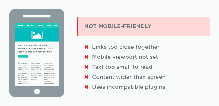
Did your Mobile-Friendly test result in one of these messages? Here’s what they mean and what to do about it.
We’ve all experienced the frustration of accidentally tapping a link when viewing a site on a mobile device.
It’s more difficult to accurately tap/press links on a mobile touchscreen than it is to click links with a mouse on desktop. It’s important to make targets larger and with more space to prevent accidental tapping of surrounding elements on mobile.
Google guidelines recommend a minimum tap target of 48 CSS pixels; this size is based on the average adult finger pad that is about 10mm wide (a bit less than half an inch).
In your site’s code, there are optional instructions – called meta tags – telling the browser information about your site. One of these is used to set the viewport. Setting the viewport controls how the website is displayed on mobile devices.
Without a viewport set, mobile devices will display the page at a typical desktop screen width, scaled in size to fit the mobile screen. Setting a viewport gives control over the page’s width and scaling on different devices. The viewport meta tag is one of the key features that makes responsive design possible.
This message triggers when it is detected that the text is too small to be legible on mobile devices. When text is too small on mobile devices it requires the user to “pinch to zoom” in order to read – this is not an optimal user experience.
Google guidelines recommend a base font size of 16 CSS pixels and adjusting the size as needed based on the properties of the selected font.
If page content does not fit horizontally within the screen size, it forces the user to pan horizontally to view the content. This issue is a little harder to troubleshoot than the others because it could be triggered for several reasons.
Sometimes the message is triggered because the viewport is not set (see above), but sometimes it’s more than that. Images could be the culprit—when image dimensions are too large (too wide) it will cause horizontal scrolling. The site code and CSS could also be the issue—if “absolute” widths are set wider than the screen, horizontal scrolling will occur. These issues can be avoided by using responsive images and “relative” CSS widths – both of which adjust to the screen size.
Some of our favorite sites have long used extra software, or “plugins,” that enable the browser to do things like stream movies, run complex animated games, and more. Some example plugins are Adobe Flash, Silverlight, and Java.
Most mobile devices do not support these plugins. Sites that require them often lead to a poor user experience on mobile, so Google marks them as “non-mobile-friendly.”
To avoid this, use modern web technologies when designing and developing your site. Nearly all content and functionality that once required these plugins can now be created using other mobile-friendly technologies.
Did your site fail the mobile-friendly test? Are you redesigning with mobile users in mind? Talk to us to understand your results and your options. Whether you are looking for some quick fixes or a complete overhaul of your mobile presence we can help you understand and define your mobile experience.
Continue to Online Product Demos to Win Over Your Customers (and Your Sales Team)…

Continue to Ongoing Onboarding: How Duolingo Introduces New Skills…
