
Online Product Demos to Win Over Your Customers (and Your Sales Team)
Continue to Online Product Demos to Win Over Your Customers (and Your Sales Team)…

When we dig into a project with a client, our focus usually begins at a very high, strategic level and then narrows as the project moves along.
We often begin by defining the business and user objectives of the system we’re designing. Identifying where the goals of the business and their customers overlap is key to developing an effective and valuable set of features.
This kind of moment is an opportunity for us to educate our clients on the fact that some design patterns are not intuitive, despite their popularity or ubiquity.
In this article, we’ll share a few examples as well as some things to consider when making your own user experience (UX) design decisions.
People bring their personal biases into practically any decision. Their natural instinct when thinking about design is to gravitate toward their personal preferences. Occasionally, this can fit nicely within your strategic objectives – but more often than not, it will be in conflict with them.
It’s important for clients and stakeholders to remember that (typically) they are not the target audience. Projecting their background and preferences onto a set of users with whom they share little is likely to result in an ineffective UX design.
It seems obvious that earning users’ trust should be a top priority. Yet, with pressure to reach internal goals and to satisfy the needs all internal stakeholders– it can be easy to lose that focus.
This dynamic can be easily identified. When we hear internal stakeholders complain that a solution is “boring” or not “flashy” enough, regardless of how well it works for users, it’s pretty clear that they are expressing a personal preference. We hear this kind of feedback pretty often and it has the potential to undermine the usability of the product.
The best approach is to return the conversation to the strategic objectives. If a main objective is to impress users with a flashy application, it would make sense to pursue and solve for that problem.
But, usually the objective has nothing to do with flashiness. Returning to the overall objectives can help diffuse disagreements and provide rationale for focusing on solutions that will lead to success.
We try to avoid using blanket statements about whether or not a particular design pattern is always a good or bad idea. Objectives, target audience demographics, technical considerations will always be among the many important factors when designing an effective user interface.
That said, there are design patterns that should be used with extra caution—here are a few examples.
The most common example of a pattern that enjoys massive popularity despite its potential drawbacks is what’s commonly known as the “hamburger” menu (and similar variants).

Example of the "hamburger icon" menu on its own
The main advantage of using this design pattern is that it simplifies the page and enables the main navigation to fit on smaller screens like mobile devices.
The main drawback of this pattern is that research indicates that users cannot reliably predict its purpose. This is true for any non-universal icon. Pairing the icon with a clear call-to-action label is advised.
It will be fascinating to see if the hamburger will eventually “graduate” into universality of icons such as print, home, etc. A 2015 study by Catalyst Group indicated that younger users are already much more likely to understand it (81%) than older users (52%), but those percentages are still too low to rely upon.
Hiding navigation items within a menu will almost certainly lower engagement with them – so pulling out a few high priority items into a separate nav might be wise. Another good idea is to feature ways to get to the nav destinations from within the main body of the page, if possible.
So, for now – be cautious and always pair the hamburger with a label such as “Menu” while making it clearly clickable. Be sure to question whether it is doing more good than harm, especially on larger screens.
If you use the web regularly, you’ve likely run into an abrupt and somewhat unsettling browser prompt that asks you to share your location. Some users could recoil and find this prompt to be inappropriate or annoying.
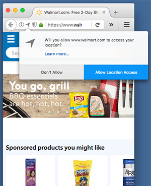
Example of location permission prompt
But the prompt can be controlled. Instead of allowing it happen automatically when the page loads, it can be better to set the user’s expectations beforehand.
Here’s an example of this scenario. You present two options to the user: fill out a ZIP code field, or click a button that says “Use my location.” Letting the user decide ensures they won’t be surprised or interrupted by an unwanted popup. And whatever you do, avoid asking for location over and over again.
Color is central to almost any design. We use it to create an emotional connection with users and to support overall brand consistency across all channels.
It also is used to communicate system consistency so that users know what to expect when they are interacting with a site or application. For example, perhaps the primary action button is blue and the secondary button is an outline of blue. Add an orange button without good reason, and the result will be confusion and lower conversions.
In this way, colors provide supportive guidance for users in intuitively finding the pathway to the content or functionality that they seek.
Finally, be mindful of the visual impairments any time you plan to use color to communicate meaning or to prompt action. A red outline on a form field to indicate an error is helpful to many users – but if used without additional context, it is disastrous to colorblind users who cannot see it. A simple solution would be to use an error icon and message, with the red color providing supportive guidance.
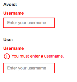
Example of too much reliance on the color red
How frequently you see a particular design pattern on your favorite sites and apps does not indicate that it’s a good option for your project. Don’t worry so much about being boring; successful user experiences often go unnoticed. You have succeeded if users are able to find what they’re looking for, complete tasks with ease and move on with their day.
Just make sure you’ve thoughtfully chosen your design patterns with users in mind. The best way to verify whether you’ve made the right choice is to conduct a user research study. No amount of debate will provide as much insight and internal alignment on how to move forward as watching real users interact (or struggle) with a site.
If you are looking for direction and want to make sure you’re advocating for your users, please contact us to learn more about how we can help.
Continue to Online Product Demos to Win Over Your Customers (and Your Sales Team)…

Continue to Ongoing Onboarding: How Duolingo Introduces New Skills…
