Meeting the Challenges of Mobile Device Usability Testing
The quality of a user experience is relative to the user’s expectations. Not so long ago, web users’ expectations were lower when using a mobile device versus using their desktop computer. But as more and more sites deliver exceptional user experiences to mobile users, expectations have shifted.
In fact, mobile users no longer expect a lesser experience on their mobile device – they expect an equal or mobile-centric experience. Our experience supports this viewpoint as well. In a recent usability lab, one respondent was surprised – even disappointed – when asked to use a desktop computer. She exclusively uses her smartphone for web access. She is not alone.
Further proof of this shift – from our perspective is the soaring demand for responsive websites and prototypes from our clients as well as from users.
This shift takes usability testing for mobile on these projects from a helpful input to a critical component of project success. But why do you need to test your website on mobile devices? What are the obstacles in the process?
Why Consider Usability Testing for Mobile?
- Not surprisingly, we’ve found there’s no better way to understand the effectiveness of a mobile device user experience than actually testing on a mobile device in the usability lab.
- 91% of American adults own a mobile phone. (source)
- Mobile device web access is predicted to overtake desktop web access in 2014. (source)
- 48% use or would like to use a smartphone to shop while in-store or on the go. (source)
- 90% of people start a task on one device, then complete it on another, according to Google. (source)
- Mobile device users have high expectations.
- There are many assumptions made about mobile users; our tests have shown many to be inaccurate.
- There is no substitute for a live study in a mobile device usability lab.
Why Consider Usability Testing for Mobile?
A standard setup for desktop usability lab is pretty straightforward. In our usability lab, video software captures the screen action while a camera captures the respondent’s facial expressions and voice as a picture-in-picture.
Mobile testing presented logistical challenges for us – we had to go back to the drawing board. We identified the following broad requirements:
- Easily alternate between desktop and mobile testing scenarios mid-session.
- Allow observers to watch the respondent’s gestures and facial expressions in real-time.
- Capture video of the respondent’s finger gestures and facial expressions simultaneously.
- Allow the respondent to use a mobile device in a natural way vs. having to conform to technical constraints in the lab.
Designing Our Mobile Usability Approach
A major goal at Crux Collaborative has been to create exceptional support for mobile device testing in our usability lab as we expect a significant growth in demand for mobile testing. We have experimented with various hardware and software configurations to find a combination that is ideal for the facilitator, respondent, and the observers. To get there, we needed to further define our goals and research what tools were available to us.
Our Mobile Device Usability Testing Goals:
- Allow phones and tablets of any size to be used
- Allow the respondent to use their own mobile device if they choose
- Allow the respondent to hold the mobile device in a natural way
- Allow observers to see the user’s gestures and site interactions along with their facial expressions
- Real time (non-buffered) playback in the observation room
- Record the session and quickly create a shareable video format
- Minimal facilitator involvement in managing the hardware or software
- Being future-ready in terms of mobile device support
- A stable, trustworthy setup that needs little maintenance.
- Be portable to allow the possibility of testing of environmental variables such as a noisy room, sunlight, moving public transit etc.
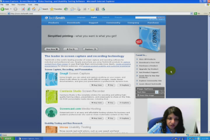
Morae
A software solution for usability testing, including recording of the screen, user, and keystrokes. The gold standard application for desktop usability testing.
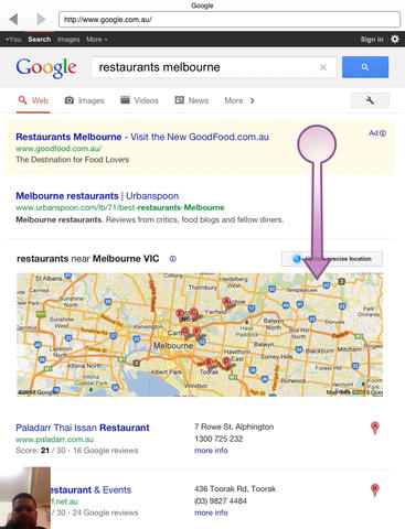
Magitest
A mobile app records screen activity and the user’s face if they have a front-facing camera.
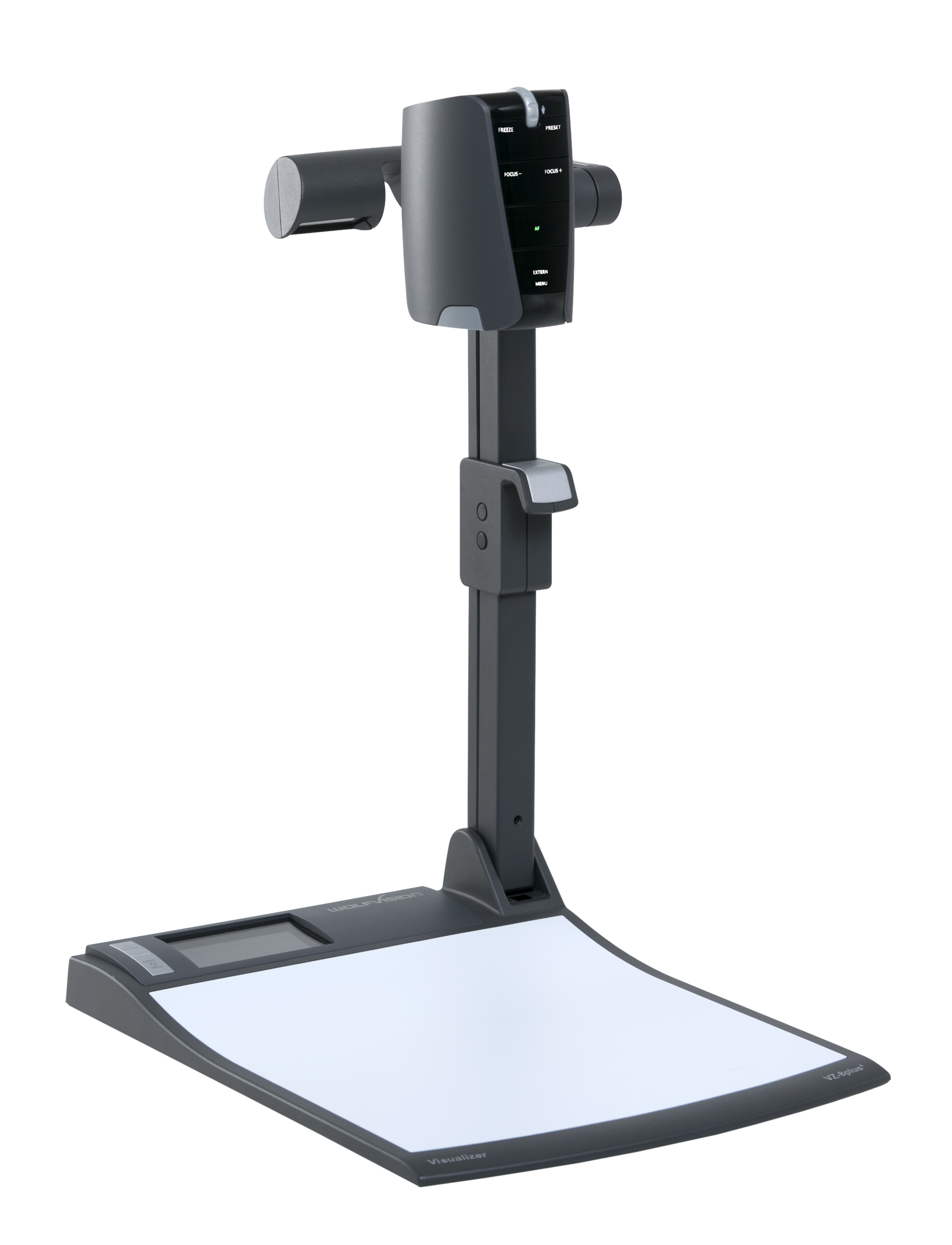
Wolf Vision Visualizer
These extremely high quality desktop visualizers produce stunning HD images. Think of the overhead projector of the 80’s with modern technology.
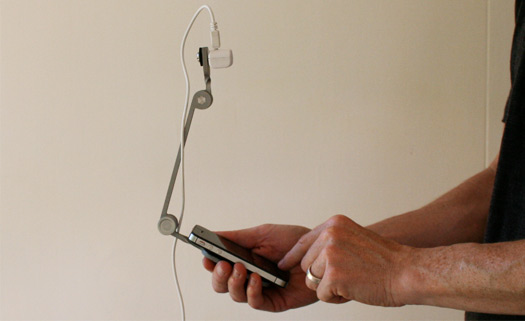
Mr. Tappy
A clever UXer from New Zealand has created a high quality configurable rig that allows highly adjustable “Go Pro” style mobile device usability testing capture.
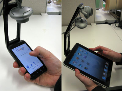
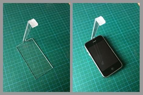
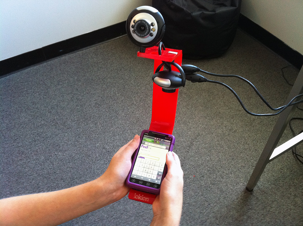
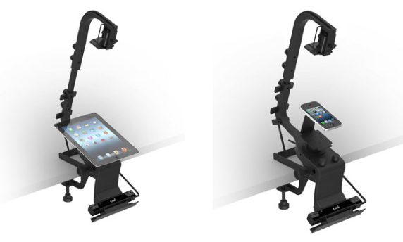
Various fixed position and custom built rigs.
Success! The Crux Collaborative Mobile Device Usability Testing Setup
After trying many of the options above with varying success, we are currently using a combination of Morae, Mr. Tappy, and a selection of custom AV programs to achieve all of our stated goals in mobile device usability testing.
In our testing of the other options, we found the visualizers to be far too limiting in terms of how respondents need to hold the device at a certain angle and in a certain spot. And the apps to be too self-contained and difficult to share in real time. Here is our setup in action:
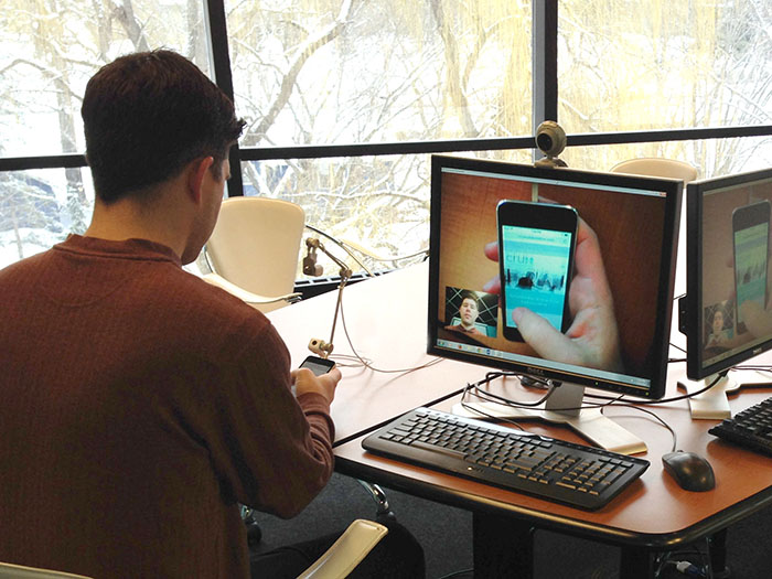
Example of a Usability Study using a Mobile Device
Looking Ahead...
We feel this setup gives us the best chance of success in capturing the usability of a given mobile device website or application. It also give us the most flexibility going forward as the mobile device landscape changes in the coming years.
In the future, we’d like to explore higher resolution wireless webcams and remote control of zoom and focus. But for now, we’re very pleased with the results we’re getting, and our clients are thrilled with the results.
If you like more information on mobile device or desktop usability testing, please contact us. We’re happy to discuss your needs and see if we’re a good fit for your project.
Related Insights
-
Budget constraints are real, and teams are being asked to do more with less all the time. But, failing to meet certain expectations can result in disappointed customers, regulatory or legal hassles, competitor disruption, and loss of business. -
Effective Ways to Plan and Budget for User Research
Learn how to plan, maximize, and be “strategic” about where to spend money on UX services in the coming year. This article will focus on research services and outline the value they provide as well as considerations for what stage to use them. Continue to Effective Ways to Plan and Budget for User Research…
-
Why Focus Group Style Usability Sessions Fail
In this article, we’re going to explore why having more than one participant in a task-based user research session is ultimately more trouble than it is worth and produces inconsistent results.
