
Ongoing Onboarding: How Duolingo Introduces New Skills
Continue to Ongoing Onboarding: How Duolingo Introduces New Skills…

We’ve discussed the radical shift over the past couple years to user experience design based on responsive web design (RWD). The mobile and tablet explosion keeps gaining steam – and has gotten the attention of all our clients. Nowadays, most of our work is on RWD projects.
To further illustrate the meteoric rise of mobile into our everyday lives, look no further than online payment processor PayPal. In 2010, payments made via mobile amounted to $750 million. Last year, they reached $27 billion.
Of course there are plenty of legacy sites and add-on functionality for old systems that will take years to retool or rebuild. In those cases, RWD is not usually an option. However, there is typically a dedicated mobile site to provide some level of support for mobile users and known best-practices to make it a good experience.
As mobile has become more integral to overall UX, we’ve discovered some key findings that we often put into practice – on both RWD sites and mobile sites. Giving these topics some attention will surely make your users happier.
The screen real estate is limited on most smartphones – and there’s natural tendency to try to shrink page elements so that they fit within the layout easier. Avoid this pitfall at all costs – especially when it comes to touch targets. Apple’s recommended size is 44 x 44 pixels. But even that size is not realistic for many users.
A study conducted by MIT concluded that the average index finger is 57 pixels wide and the average thumb is 72 pixels wide. Ignoring these facts invites usability nightmares like accidental clicks, which frustrate users – especially if occurrence is during a transactional process.
An equally important and less acknowledged result of using small touch targets is how drastically it slows users down and lowers accuracy. With small touch targets, users must be very careful to tap very lightly, so that only the tip of the finger pad makes contact. This subtly adds a layer of difficulty and frustration for users, who may abandon your site.
Appropriately sized and spaced apart touch targets can make a world of difference. Your site will be seen as easier and more enjoyable to use.
More on touch targets:
Not long ago, there was a well-established belief that mobile users are on the go and that context was the key to their experience (e.g., finding the nearest coffee shop). And while it’s true that people use their smartphones on the go (e.g., waiting in lines, during commute, etc.) – studies show that’s just the tip of the iceberg.
In fact, 68% of smartphone use actually happens in the home and the typical uses are not what you might expect. A ”mobile” location is not as important as once thought and most of us aren’t just pulling out our mobile phones to accomplish a specific, mobile-relevant task. A whopping 46% of time on mobile devices is spent on “me time” (entertainment, etc.) followed by socializing (19%), shopping (12%), and managing finances/health/productivity (11%).
We at Crux Collaborative often hear assumptions about what mobile users would or would not do on their smartphone (and we even make them ourselves). But our experience in the usability lab and external research suggests such assumptions are not accurate. With a shrinking market for personal computers and 25% of U.S. users relying exclusively on their mobile or tablet for Internet access – it’s becoming clearer that users will do way more on their smartphones than anyone ever imagined. And yes, that even includes complex transactional tasks that seem much better suited to a desktop screen.
As #2 above illustrates, mobile usage is not happening in a vacuum. Even though we talk about separate types of users routinely, users are not “mobile users” or “desktop users” in reality. Many people – perhaps most people – are multi-device users and shift between them throughout the day.
Do not assume users want to see less or different content based on the device they are using. As a simple example scenario: a user may visit your site from their work computer during the afternoon and then “return” to your site from their smartphone in the evening. Will they expect to see different content? Of course not. Content should support a fluid experience across devices whenever possible.
Studies show that users do not like to fill in lots of large text fields when completing forms on mobile. The mobile keyboard is a pain and users will give up rather than go through the misery of typing for an extended period of time. Users will also abandon if faced with too many dropdown menus (also a pain to use on mobile).
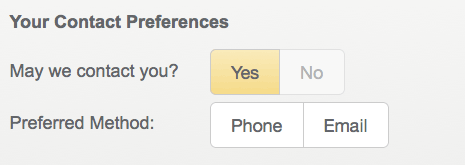
Example toggle buttons
We suggest giving users bite-sized chunks and easy non-typing fields whenever possible. We design toggle buttons whenever possible since we can ensure they have an ample touch target – and the instantaneous feedback of toggle buttons is easy for users to understand.
One thing we know is that faster load times result in a much better experience for mobile users. Unfortunately, it seems that the focus of developers in this new RWD world has been mostly on “making sites work” and not yet on making them perform well.
A lot has been written of how responsive design has actually resulted in larger and slower sites. Much of this is true. Frameworks like Twitter Bootstrap and Zurb Foundation come with lots of extraneous code and files. But with proper post-processing, sites using them can be tuned to perform quite well.
The bigger issue has been the way images are loaded. Up to now, a smartphone user has had to download the desktop images and the images that are adjusted for their smaller screen – thereby making the overall file size much bigger, and the load time slower. On top of this, lots of sites add JavaScript “picturefills” to help do some of the work too, slowing things down even more.
The good news is that a group of dedicated web whizzes from such organizations as Google, Mozilla, and Opera got together and came up with a new web standard to solve this particular problem – called the <picture> element. And the latest word is that it has been approved by the browser vendors and is going to be rolled out in the coming months. Essentially, this solution will use your device’s screen size and resolution (think: retina images) to load the correct image, and only the correct image.
With the image issue resolved, we recommend setting aside time and budget to fine tune your site with mobile users in mind. A faster response means a more engaged user and a better user experience.
Whether you are working to optimize an existing site or application for mobile users or have the luxury of developing one that allows for multiple screen sizes to be considered at the outset – keeping these things in mind will ensure that your users have a more optimal mobile experience.
If you’re interested in learning more about how to optimize the usability of your mobile site or application, contact us. We’d love to hear about your project needs and see how we can help.
Continue to Ongoing Onboarding: How Duolingo Introduces New Skills…

