
Ongoing Onboarding: How Duolingo Introduces New Skills
Continue to Ongoing Onboarding: How Duolingo Introduces New Skills…

System downtime - It happens. We all want to make sure our system is always available for our users. We build in redundancy and have catastrophic recovery plans. However, all the best planning can and unfortunately does go sideways at some point. How your system users experience the downtime is a critical part of the user experience and it’s important to think about it before things go wrong. Planning for the worst case will guarantee that your users know what’s up and what to expect.
A few weeks ago, Basecamp had an issue and was down during my US central time zone workday for about 5 hours.
I realized this after:
Every time I clicked the post or add button, the system seemed to be working and then the page would revert back to my drafted entry or empty form page and a ‘Post’ or ‘Add’ button. Nothing was submitted, and I got no messaging about what was going on.
Only after trying to accomplish these tasks multiple times did I finally notice a banner on the home page that subtly announced the issue. While I landed on this page when I first came into the system, as I do at the start of every work day, I scrolled right past this message. I didn’t even scan it. Nothing about it indicated that this particular system message was critical.
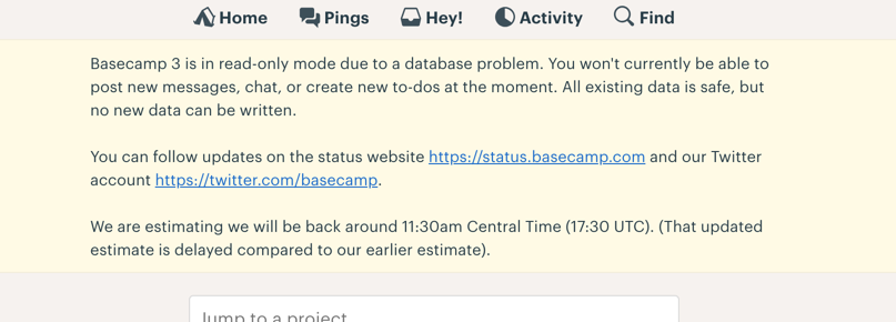
Basecamp banner notification
Yes, it does say what the issue is right away in the first sentence, but I never read that sentence. This banner space is often used to announce feature updates, and I’m used to ignoring that area. More clients than I can count have said ‘but it says so right there’ during usability testing, frustrated that their well-crafted content is failing to communicate the message. However, the visual design of the message is as important as the content of the message. More so if it makes the site or system user notice the message at all.
Worse, a coworker got into Basecamp without ever having the opportunity to see the outage message. Basecamp allows users to access a specific post or item in the system via an email notification. This bypasses the system home page. If the home page message were effective, it would have been missed anyway. Without inline messaging when users try to accomplish tasks, neither of us initially realized that there was a known system outage.
Not addressing the possibility of downtime is a mistake that most teams make. Downtime will happen with every system at some point. While users have higher and higher expectations of up time and we all focus on avoiding downtime all together, we all know that on occasion, all the best planning can’t avoid a critical failure. Spend some time, not just on your backend remediation plan, but on the front-end messaging and behavior.
Make sure your messages look critical. If I’ve learned anything in all the research we’ve done with people, it’s that they DO NOT READ. I know it’s hard for those of us who work to craft careful messages to hear that, but we need to accept that humans look for patterns and if they don’t see something as a visual distraction, they’ll stay focused on the task they’re looking to complete. This is why I scrolled past the Basecamp home page message. Nothing about it stood out and I had to add a client to the system. The first consideration when displaying critical messaging to a user is to make sure you have their attention.
See this example from Bitesquad that I encountered a few days after the Basecamp outage. It’s not communicating an outage, but it is clearly warning that your Bitesquad experience may not be ideal.
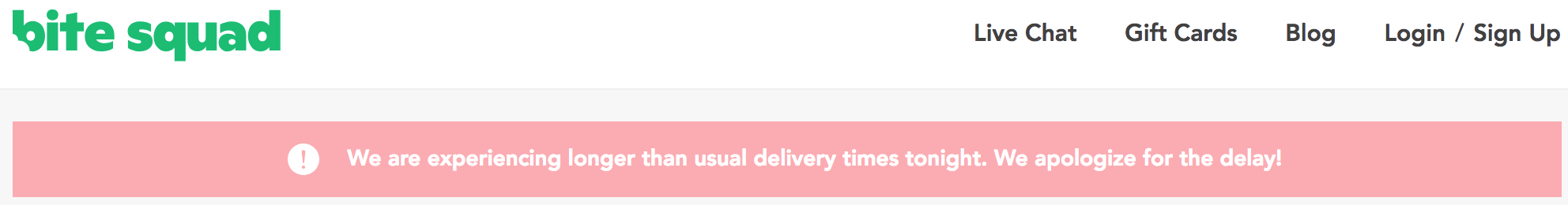
Bitesquad notification
There’s no chance of missing this message.
Consider where and how your users interact with the system so you can get critical messages in front of them. In the Basecamp example, they offered no messaging beyond the home page to let users know why things weren’t working. If clicking a button doesn’t result in the expected outcome, the system should notify the user that there is a problem.
Do you have a mechanism in place to communicate to your customers and users if your site or system experiences a critical failure? If not, there’s no time like the present to identify a strategy that will inform your users of the problem and communicate key details about the outage.
Not sure how to get started? Would you like a partner as you develop a strategy to handle critical downtime? Get in touch with us to start a conversation about how we might be able to help.
Continue to Ongoing Onboarding: How Duolingo Introduces New Skills…

