
Ongoing Onboarding: How Duolingo Introduces New Skills
Continue to Ongoing Onboarding: How Duolingo Introduces New Skills…

The kinds of applications we help to create are complex and transactional. Our clients look to us to help ensure their customers can accomplish tasks fundamental to the their success.
In these hard-working applications, the content can help to make or break the experience we’re tasked with delivering to end users. For this reason, our team often deliberates at length not just about what content is needed – but how that content is delivered.
These decisions are always highly dependent on the audience, the user needs, and the business objectives – but there are some best practices we typically follow. In this article, I’ll share some of tips for making your hard-working content work better.
When we conduct user research, respondents are asked to share their thoughts as they explore the application. One reliable sign things are going well is we’ll hear that the site is very "clean."
When a user sees an experience as 'clean' they feel less overwhelmed and more confident that they can understand the details they're seeing – and it opens users to learning and exploring. If users feel comfortable, we can then direct their attention to help them more quickly and easily figure out what to do next.
Simple can be harder than complex: You have to work hard to get your thinking clean to make it simple. But it's worth it in the end because once you get there, you can move mountains.
- Steve Jobs
Simplicity is crucial because users are only able to process so much information at a time. The more details a user has to digest at once, the higher the cognitive load. Things like clutter, unexpected or unfamiliar elements, and dense sections of text may make users feel overwhelmed. Once that happens, it often leads to confusion, frustration or users abandon the experience altogether.
Sadly, there is no magic formula to make an application simple. You probably know it when you experience it – or, more likley – you know when you don't!
One technique we use is called progressive disclosure. This involves showing only the content that is most critical so that users can focus on the task they’re trying to accomplish. If more context is needed or additional content needs to be presented, secondary content can be revealed by user interaction.
Common interface elements that use this approach are megamenus, drawers, modals, popovers, nested form questions, tooltips and “read more” or "show more" links.
This is especially useful when designing mobile-friendly and complex systems, where you must strike a delicate balance between providing enough context and retaining simplicity.
Within a complex multi-step process, for example, it is critical to keep users focused on the main tasks of each step. But there may be topics or questions that some users don’t understand along the way. Very likely, the best approach would be to provide additional background content using progressive disclosure – with an overlay solution like a popover.
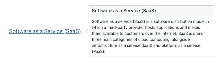
Example: A popover keeps secondary content hidden until the user chooses to view it.
Use progressive disclosure judiciously. It will not help users to hide critical details and force too much clicking.
On a deeper content page or a confirmation screen, for example, users may expect and prefer to see all of the content rather than having to dig around for details they are seeking. This can be especially true if users might wish to print.
Effective content follows a clear up-and-down order of depth – or hierarchy – in which the broad topic is stated in the page title, and nested sub-headers are used to declare the sub-topics.
Presenting a clear hierarchy is essential because users generally do not read screen-based content word-for-word. Instead, they scan the page and try to efficiently figure out what to do next.
When users are not presented with an obvious hierarchy to guide them, they often struggle to understand the information and complete their desired task. Users who are merely guessing at how the application works are less likely to be successful and may get confused or make a wrong selection.
Providing a properly nested order of content is not just a best practice, it is a requirement if you plan for your application to meet modern accessibility guidelines.
The latest guidelines require that page structure and heading structure are semantic and follow an expected order. This allows assistive technology like screen readers to move quickly through the application - after all, visually impaired users want to be able to quickly scan content like anyone else.
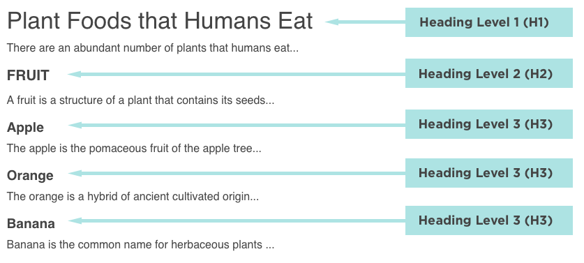
Example: A properly nested set of headings will be easier to scan and pass accessibility guidelines. Credit: w3C
It's a no-brainer to provide accessible content but doing so takes some practice. The key is to think and present ideas in an outline format, sometimes providing headings when you might not think they are needed.
It's important to note that other types of content need to be formatted correctly for accessibility as well. Lists should be coded as lists. Icons need to be announced to screen readers. Images must have proper alt text.
Basic accessibility testing will help you know if you've done it right. And if you have, the result is better, more scannable content for all users. Your users will thank you for it.
When you're thinking about creating content, start paying attention as you use the web with a critical eye. What content works and what is slowing you down?
We make choices in our user experience design to improve readabilty. Some things that can improve readability include:
Applying some of these techniques to content on your hard-working applications will likely result in more satisfied users. But the only way to know for sure is to conduct user research and make sure your content is working as expected.
Not sure how to get started? Would you like a partner as you work to improve your content and take it through user research testing? Get in touch with us to start a conversation about how we might be able to help.
Continue to Ongoing Onboarding: How Duolingo Introduces New Skills…

