
Ongoing Onboarding: How Duolingo Introduces New Skills
Continue to Ongoing Onboarding: How Duolingo Introduces New Skills…

Do you remember the first web pages you visited? Back in those days, all links were treated exactly the same – every link on a page was blue and underlined, the text turned purple after the link was clicked. Best practices in usability and UI design for links have evolved since that time, but some foundational guidelines from that era still apply.
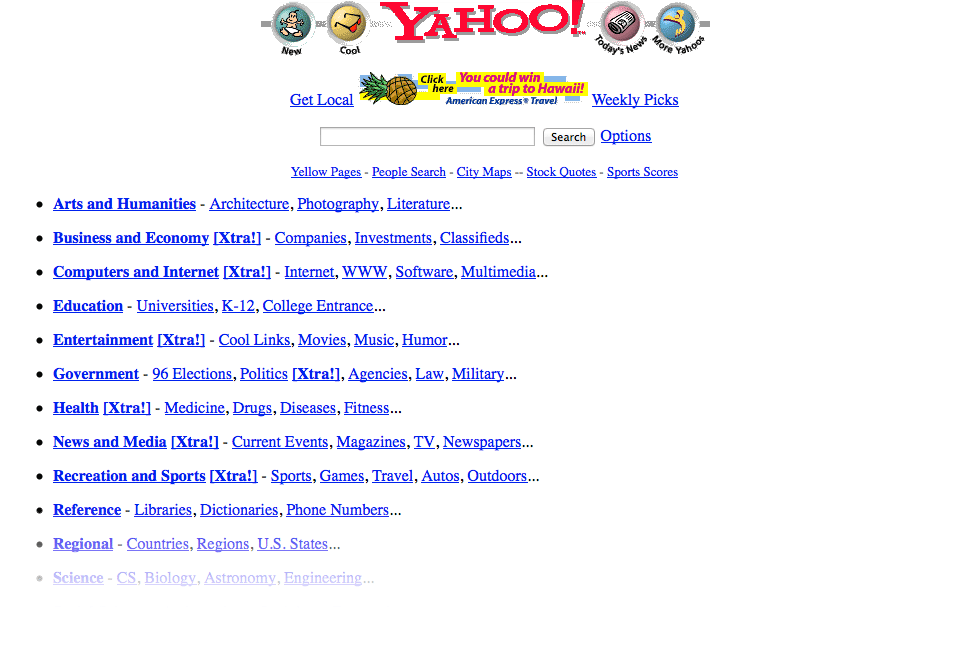
Yahoo! circa 1997
At Crux Collaborative, we conduct research on highly transactional, complex websites, and applications. Lately, we have observed a web-design trend that is causing frustration for users. The inconsistent use of color for links, copy, and navigation makes it difficult for users to absorb the content and quickly understand what they are supposed to do next.
When users typically visit a site, they scan the content and look for actions, keywords, and points of interest. Few people actually read all the words on the page unless something piques their interest.
In that initial scan, users learn the “language” of the site. They note how content is presented and how clickable elements are displayed. The goal of a successful transactional experience is to make the page as easy to scan as possible while providing clear, focused calls to action – in other words – use a language the user can easily learn and understand.
It’s not a difficult thing to do if you pay attention to the details and focus on consistency. Here are a few tips on how to make your site more intuitive and easy to use:
We often see the same color used for both links and static elements such as headlines. This is one of the most common mistakes made with color – we call it a “visual homonym” because it uses the same “word” in the design language for two completely different meanings.
We recommend establishing a consistent set of colors reserved for links and button navigation. This will help users easily scan the page and identify the active, selectable items. Choose one color for in-page contextual links and buttons and use a separate color for key content or headlines. Additional colors can be used for secondary buttons, links, or subheads.
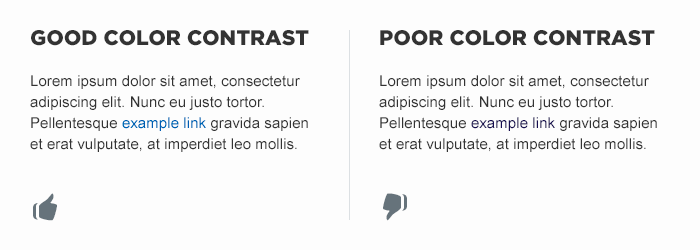
It is also important to consider contrast when creating the visual system for your site. To be readable, the text color must contrast with the surrounding text and background. Remember that users scan the page for actionable items so make sure the links are obvious and stand out.
Inconsistent styling can also create challenges for users trying to identify which actions they can take on a page. Again, it comes down to reserving the style used for actions and using it consistently.
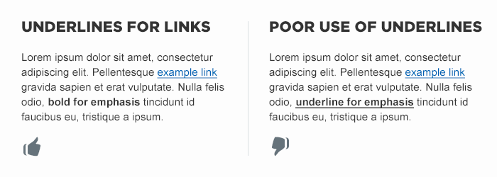
For example, a common mistake is to use an underline to emphasize content. Since underlines are often used to identify contextual links, users will likely assume the underlined content is actionable. It is not necessary that all links be underlined – it is inconsistency in type treatment and styling that causes problems.
Whichever style you choose for key interface elements, remember to use a consistent language. If site links are preceded or succeeded with an arrow, that arrow style should not be used to call attention to other static text.
Positioning static text on a webpage or application where it can be perceived as navigation can create challenges for users. To avoid confusion, establish a visual language that clearly distinguishes between navigable items and static items.
For example, if the site displays a series of headlines within the page, clearly indicate which are links to additional content and which are not. Users become frustrated when they click on a static text – they expect to find more information about a piece of content and they are let down when it turns out to be a “ghost link”. It’s a tiny disappointment that can be easily avoided by following a few simple rules:
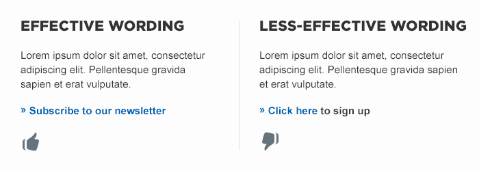
A very common mistake we see on sites is the use of the words “click here”. When users scan the page, they are looking for a specific action to take. That’s why “Subscribe to our newsletter” is more effective than “Click here to sign up” and “Learn more about Cogswell’s Cogs” is more effective than “Click here to learn more about Cogswell’s Cogs”. The quicker a user can identify the result of the action they are taking the better.
These simple changes will make it easier for your users to see links and take the action you want or need them to take.
Contact us to learn more about how we can help establish a consistent and effective visual vocabulary for your website or application.
Continue to Ongoing Onboarding: How Duolingo Introduces New Skills…

