
Ongoing Onboarding: How Duolingo Introduces New Skills
Continue to Ongoing Onboarding: How Duolingo Introduces New Skills…

Your last car salesperson didn’t ask if you wanted power windows. That’s because they’re standard on most U.S. automobiles – but that hasn’t always been the case. At one point, power windows became so common that buyer expectations shifted. Carmakers have to foresee customer expectations or they risk giving an edge to competitors who offer a feature standard.
Redesigning your website similarly imposes decisions tied to user expectations. Features that were once experimental may suddenly become expected. Over the past few years, mobile device support – specifically, responsive design – has been racing toward becoming a standard expectation.
In a nutshell, responsive (and adaptive*) design is the practice of presenting a single website to all devices, adjusting the layout to match each user’s screen size. And while responsive design is becoming more commonplace and offers many advantages, research indicates that users still strongly prefer to use a personal computer – rather than a mobile device – for complex tasks.
Here at Crux Collaborative, providing solutions for intricate business problems and complex tasks is the majority of our work.
So, we face a familiar conundrum again and again. Should our client invest heavily in mobile device support even though their users may not use it? To answer this, you need to identify the business case for responsive design; only then will you feel confident about your decision.
In this article, we’ll help you weigh the pros and cons so that you can make the best possible decision for your organization.
Little more than a decade ago, user experience (UX) design was considered by many to be a luxury – or even an extravagance. Today, that’s far from the case. UX plays a standard role in most modern web systems design. Why? Because user-focused experience became expected.
Once users experienced and developed a preference for user-focused designs, sites could differentiate and wow users with it. Organizations jumped at this competitive advantage, it snowballed, and eventually user expectations shifted.
Today, instead of exceptionally good experiences being noticeable, it’s poor user experiences that stand out as unacceptable and frustrating. Once this kind of shift takes hold, the business case becomes crystal clear to decision makers. But it’s not always obvious while it’s happening.
This leads to the question – will your users expect full mobile device support, either at launch or during the life of your web application?
Here is a simplified rundown of your options when designing your website:
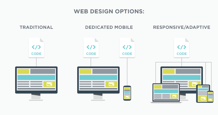
Of course, you can create a native app as well, but we recommend a cautious approach since the return on that kind of large, ongoing investment only makes sense in particular contexts.
Either way, your website must deliver the functionality and content in a way that is easy to understand and use.
As a starting point, find out your current mobile traffic statistics and try to identify trends. By cross-referencing them with overall trends, you can begin to forecast changes on the horizon.
In some cases, new web features can be added with minimal impact on cost. When it comes to responsive design, however, the impact on your budget will be substantial.
The main factor affecting the budget required relates to simple math. We usually design for 3-5 screen sizes (breakpoints) in a responsive project. This means every part of the process must consider the implications of each screen size on each page. How does the content adjust? How do images adjust? Will the layout or element order change?
Up front, we require extra work to prioritize and reflow content. This exercise is incredibly valuable, but can be difficult and time-consuming. After the content is planned, there is additional design and coding that must happen to bring these ideas to life.
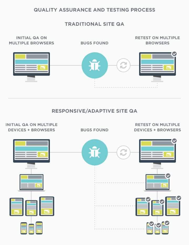
And last but certainly not least, the quality assurance and testing process is exponentially more involved and time-consuming. We must ensure that each element on the page behaves as expected on a multitude of device types and sizes. After each significant change or bug fix, we must re-test on the same multitude of devices.
Including a dedicated web performance (i.e., page speed) phase also is a must.
The biggest advantages of responsive design relate to it being a single site. Your code base is consolidated, as are your QA cycles. It enables you to manage the content centrally and without needing to duplicate effort or have multiple processes. It also makes social linking and tracking of metrics much simpler.
Most importantly, you will see an increase in user satisfaction. In a recent Crown Partners survey, 68.6% of organizations cited better overall user experience after implementing responsive design.
Other advantages include:
The many advantages noted above can lead to greater efficiencies, brand reinforcement and future cost savings. Unfortunately, there is no simple formula for extrapolating your dollar-for-dollar ROI – but there are some results and statistics we can point toward, including:
Source: Zurb.com Why are Designers Pursuing Responsive Design?
It’s easier for small companies to remain nimble and appear modern. For larger companies, it can be more like turning an aircraft carrier. As new web features begin to catch on, our clients often stay on the sidelines and rightfully so. There’s no shame in waiting it out to confirm whether we are experiencing a “fad” or an actual shift.
We can tell you with certainty that mobile is not going away and unlikely to decline. We released our annual compilation of mobile statistics last week, and it’s clear that mobile devices are an integral part of daily life for many people. In fact, 46% of adults say they “can’t imagine life without” their smartphone.
Does that mean they will use it to sign up for their health benefits or use it to complete a complex financial transaction? Not necessarily.
But the possibility is there. More importantly, its possible users will expect to be able to do these things in the future. Maybe while waiting in line, or while riding home on transit, or while watching their favorite program on television.
The cost of a responsive redesign is significant, but – if done right – it comes with the peace of mind that your site is ready for anything both today and a few years from now.
If you want to know about our responsive design process or you could use our expertise to determine what’s best for your organization, we can help. Contact us to start the conversation.
* The term “responsive design” in this article refers to both fluid responsive design as well as adaptive (multi-breakpoint) design.
Continue to Ongoing Onboarding: How Duolingo Introduces New Skills…

