Ongoing Onboarding: How Duolingo Introduces New Skills
Continue to Ongoing Onboarding: How Duolingo Introduces New Skills…
At Crux Collaborative we work with many healthcare and financial clients. These highly regulated industries typically require us to design and develop sites and applications that comply with web accessibility guidelines for users with disabilities.
There are a lot of details and specific audience needs to consider when designing a site to be accessible. For example, blind users need the site work without a mouse and with a screen reader. Deaf users need any videos on the site to include closed-captions.
Another audience is users affected by low vision disability. In this article, we will provide some recommendations to help create sites that are accessible to this audience.
Low vision is a common condition among the elderly, but it can also occur in individuals of any age as a result of conditions including macular degeneration, glaucoma, diabetic retinopathy, cataracts, or traumatic injuries. Any text on the site must meet the proper contrast ratio needed by these users for readability.
Contrast is the difference in color that makes an object distinguishable from those in close proximity to each other—the greater the contrast ratio, the better the readability for people with low vision impairments. Designing with proper contrast ratio is also beneficial for users with color blindness.
Color selection plays an important role in meeting this contrast guideline. Color selection is also a primary component of a brand’s identity system. Established brand color palettes often fail to meet the required color contrast ratio for web accessibility.
First—Let’s take a minute to understand the official contrast requirements:
The visual presentation of text and images of text has a contrast ratio of at least 4.5:1; with a few exceptions for large text, text or images that are incidental, and logotypes.The 4.5:1 ratio is used in this provision to account for the loss in contrast that results from moderately low visual acuity, congenital or acquired color deficiencies, or the loss of contrast sensitivity that typically accompanies aging.w3.org
So, what can be done when your brand color palette does meet the contrast requirements? Here are some things to consider.
Allow flexibility in your brand guidelines for interactive use; allow tints or shades of the color palette. A tint is a mixture of a color plus white to be used to increase the lightness of the color. A shade is a mixture of a color plus black to be used to increase the darkness of the color.
Use tints or shades to modify a color enough to ensure you receive a passing contrast ratio—while still staying within the overall brand identity’s color palette.
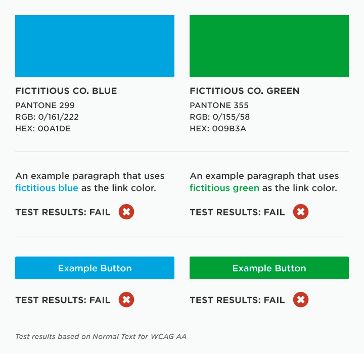
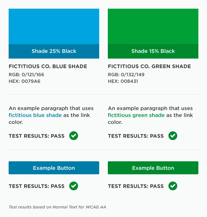
The example below shows how a fictitious primary color palette fails the contrast test until shades are applied.

Example of Failing Color Contrasts

Example of Passing Color Contrasts
If you’re in a highly regulated industry that needs to adhere to web accessibility guidelines, we recommend extending your brand color palette and guidelines to support it.
Create an extended brand color palette that complements and works with your existing brand palette. When selecting colors, do rigorous color contrast testing. Think through how the extended colors will be used for key interactive elements like buttons, navigation, links, and body copy to ensure the proper contrast needed for readability. If you’re rebranding and creating a new brand palette, keep accessibility in mind from the get go and create a color palette that supports accessibility.
There are some great online tools available to test for color contrast.
Does your current brand guidelines include a color palette that supports optimal color contrast? If adherence to web accessibility guidelines is a requirement for you, contact us to learn more about how we can help you create a more usable system.
Continue to Ongoing Onboarding: How Duolingo Introduces New Skills…