Ongoing Onboarding: How Duolingo Introduces New Skills
Continue to Ongoing Onboarding: How Duolingo Introduces New Skills…
Good user experience design can fall apart when just one feature is executed poorly. One of the areas that we often see this kind of unraveling occur is in the stepped process. Many websites employ a stepped process to guide the user through a complex set of tasks such as site registration or configuration and purchase of a product or service. Creating an intuitive, easy-to-use stepped process helps users avoid frustration and successfully complete a primary task or business process.There are three primary reasons to use a stepped process: to logically group inputs, set clear expectations for the user, and to track progress within a complex process.

Image Source: Placeit
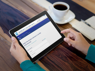
When a user is going to take on a complicated process, it is important to manage their expectations up front about how much of a commitment in time and effort it will be. If the user thinks the task will take two minutes, but in reality it takes fifteen, the user will not have a positive experience. Providing a scannable, high-level description of the process and an estimate of the time commitment will help users plan for a more complicated task.
It is also important to let the user know if there are any materials, personal information or documents they might need to have in advance before they get started. This is especially important if the user does not have the ability to save their progress and return to complete the process later. Be sure to use clear language to define the items and information they will need before they start.
One of the most critical components in a successful stepped process is the progress tracker. This is the visual indicator that allows the user to understand where they are in a given process, how much they have completed and how much more they will need to do.
Progress trackers should be displayed in a prominent part of the page that does not interfere with primary or secondary navigation. They should include all the steps the user will need to complete and a clear visual design for completed, current and remaining steps. If you have to accommodate a process where the number of steps required varies based on the users answers, be thoughtful about labeling in the progress tracker. There is nothing more frustrating than to expect to complete 4 steps, answer a question and see a step 5 appear.
Good form design is a big part of creating an effective stepped process. It is crucial that the user feel confident when entering their personal information and submitting an online form.
Long forms can be overwhelming to the user. Grouping related questions and information will make it easier for the user to scan and understand quickly what information will be needed. Proper alignment of the form labels and fields, along with consistent use of color, also make a form easier to scan.
Complex multi-stepped processes can employ a variety of input mechanisms. Make sure you use the most efficient means of communicating the action you want the user to take. Often, the simple approach is more effective than trying to integrate an element that is “cool” or more “fun”.
Most users we interview during usability evaluations indicate that their primary goal is to complete the task quickly and accurately. We generally design forms that use basic elements such as radio buttons for decisions and check boxes for multiple-selection options.
These are established patterns that help users quickly understand the question and what sort of answer they should be providing. Adding unneeded complexity or deviating from established patterns can create usability problems and may not translate well to mobile and tablet views.
The next, previous, and final submission steps should be easy for the user to identify. Provide users with a consistent mechanism to move from one step to the next and only provide buttons for required actions. We recommend avoiding the use of “cancel” and “clear” buttons. There is nothing more frustrating for a user then filling out a complicated form only to accidentally select the clear button, forcing them to start over from the beginning.
The end of the process is just as important as all of the steps the user has taken to get there. Clearly communicating a summary of the inputs and next steps will assure the user they have successfully completed the task.
Provide a way for the user to review their inputs prior to submitting the last step, especially if the process is related to sensitive data like financial or health related information.
Most people expect that once a process is complete they will have immediate access to the result. If there is a waiting period, make sure the information on how they can check the status of their request is front and center.
Need help implementing or creating a complicated multi-step process? Talk to us about the right approach to meet your business requirements and user’s needs.
Continue to Ongoing Onboarding: How Duolingo Introduces New Skills…