
Ongoing Onboarding: How Duolingo Introduces New Skills
Continue to Ongoing Onboarding: How Duolingo Introduces New Skills…

Last night, the NFL forgot about its legions of colorblind viewers. Is your site doing the same?
Imagine submitting an online form and receiving an error message that reads, “There was a problem with your submission. Please correct it.” You scroll down the page but there’s nothing indicating the cause of the problem.
This is a scenario that users with color blindness experience every day since they cannot differentiate the fields highlighted in red.
In this article, we’ll explore some of the challenges faced by colorblind users and share some simple steps you can take to support them in your design choices.
Definitions of color blindness can get really technical really fast. To put it simply, color blindness (or color vision deficiency) is the inability or decreased ability to see certain colors, or perceive color differences.
The term color blindness is a bit of a misnomer – most people with color blindness are able to see things as clearly as other people but they have a hard time distinguishing between colors.
There are a several different types and degrees of color blindness but the two main types are: those who have difficulty distinguishing between red and green, and those who have difficulty distinguishing between blue and yellow. Only in extremely rare cases is a person unable to see any color at all.
Red-green color blindness is the most common deficiency, affecting approximately 1 in 12 men (8%) and 1 in 200 women (0.5%). The visual examples below simulate how colors are perceived for people with Deuteranopia (green color blindness) and Protanopia (red color blindness).
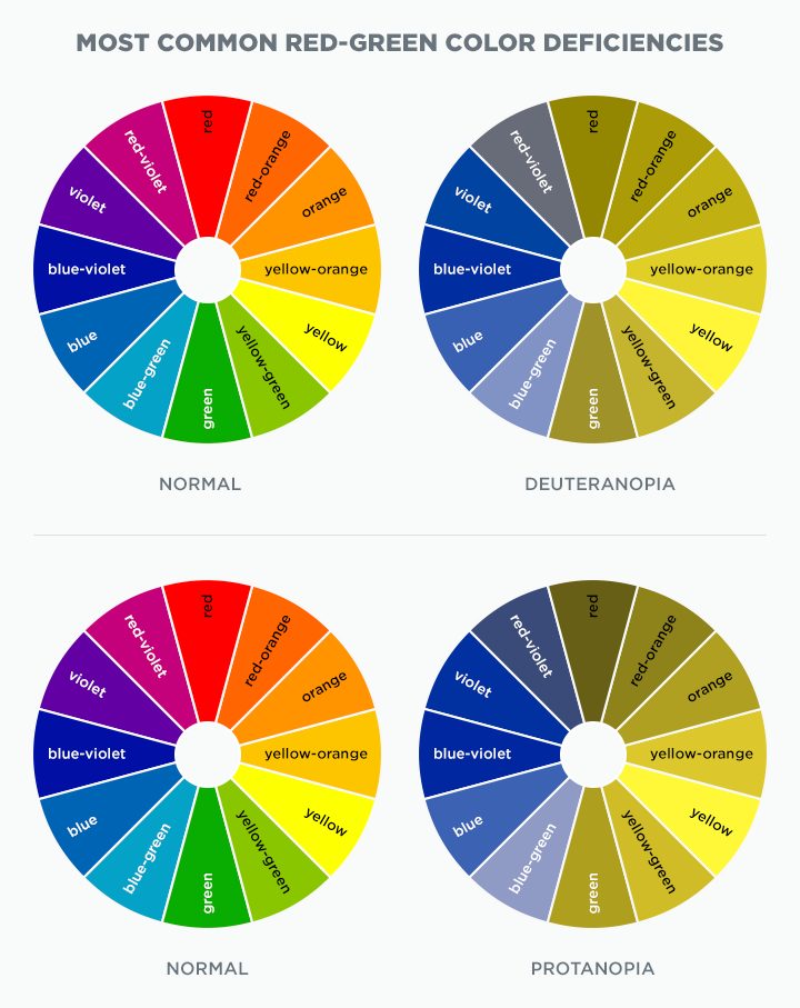
Most Common Red-Green Color Deficiencies
There are a couple key accessibility guidelines for designing for users with color blindness, according to the World Wide Web Consortium (W3C).
We’ve created some visual examples below that demonstrate these guidelines.
There are several well-established color cues designers use to convey information. When designing forms, it is common to associate green with success and red with errors. However, relying only on color can be problematic for users with color blindness.
In the example below, the form field design relies only on red and green to indicate fields with and without an error. In this case, you can see how red and green are indistinguishable from each other for a user with color blindness.
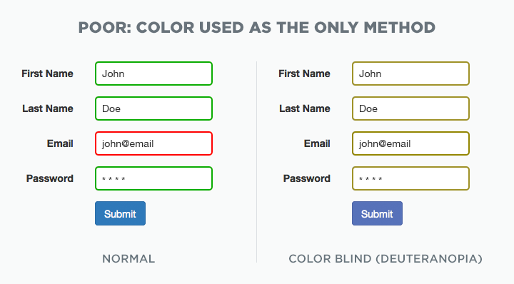
Poor Form Design Example
There are many design and development techniques that can be used to create a better design. In this example, we show how adding additional visual cues and inline error messaging helps indicate fields with and without an error – and ensures users with color blindness can understand the information.
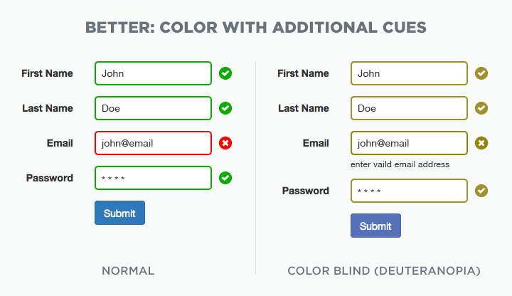
Better Form Design Example
Charts and graphs come in all shapes and sizes—bar charts, pie charts, line graphs, and so on. But they usually have one thing in common: color-coded data and legends. This type of color-coding can be problematic for users with color blindness. It can be difficult to match the color in the legend to their counterparts in the chart or to tell the different segments apart from each other.
In the example below, we show a common design style for a pie chart with a color-coded legend. In this case, you can see how certain colors become indistinguishable as they blend together to nearly the same color for a user with color blindness.
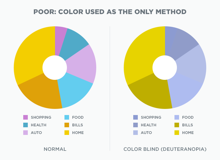
Poor Chart Design Example
Again, there are multiple design and development techniques that can be used to create a better design. In this example, we show how adding white borders between each segment helps define them. Adding labels to the pie chart clearly differentiates each category making the chart more accessible to users with color blindness. Patterns could also be used to convey the same information in a manner that does not depend on color for charts and graphs.
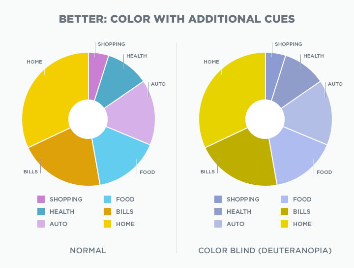
Better Cart Design Example
Most users with color blindness can still perceive contrast. Contrast is the difference in color that makes an object distinguishable from those in close proximity to each other. The greater the contrast ratio, the better the readability for people with low vision impairments including color blindness. In a previous article we discussed the importance of color contrast to aid in accessibility.
There are some tools available to simulate color blindness to help aid in design.
Coblis by Colblindor: This tool was designed to simulate how an image looks like with certain types of color vision deficiency.
NoCoffee Vision Simulator: This tool is an extension available for Chrome. NoCoffee is a helpful tool for understanding the problems faced by people with slight to extreme vision problems including color blindness.
The visuals and resources shared in this article demonstrate only a few examples of how you can design better experiences for users with color vision deficiencies. If adherence to web accessibility guidelines is a requirement for you, contact us to learn more about how we can help you create a better experience.
Author's update - November 9, 2018: A woman named Meg contacted us and shared a wonderful story that we want to pass along. She said her son, Ben, used this article as research for a school project on color blindness. Ben is color blind, so he saw it as a great opportunity to help his friends and classmates understand what being color blind is like for him.
We share in his passion for research and in helping to inform people about color blindness. Through education, we can make experiences better for all.
Here's an additional resource Ben recommends in hopes to educate a wider audience on color blindness. Thanks, Ben!
A Nurse’s Guide to Assessing Color Blindness: This resource contains additional information on signs and symptoms of color blindness, types of color blindness, causes, and color tests.
Continue to Ongoing Onboarding: How Duolingo Introduces New Skills…

